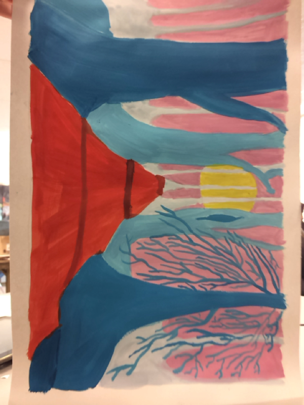
This is my personal Disney drawing. I did it after the spooky trees painting and used all of the techniques that I learned in that painting, in this one. This painting shows magical features with a bright moon and a bright pink background, blue trees, and a large main road in the middle. The road shows depth and distance with the rolling hills added, and it looks like its leading to the moon. One of the trees has a ton of branches to show that it's closer than the other trees but further than the darkest one.


This is my painting of spooky trees. I used several different techniques that I've learned throughout this semester on this painting. From the use of depth with darker trees in front to look bigger and lighter trees in the back to show distance. I also provided a ton of detail with the little dots on the trees. The background color is a light mint green because it shows bright contrast with the purple trees. I have learned a lot this year and this painting shows the many different assets I've learned.

 
This is my landscape drawing of a road I like to visit and take pictures of as the seasons change. I tried to portray depth by using different hues of blue and yellow to show how close the road was to the camera. I also tried to use space of objects to create a cooler looking picture. 

Name______________________date_________________pd_________

Impressionist landscape drawing rubric

Grade/comment


5

4

3

2-0

I can upload on my website two separate  photographs with my finished drawings


I can draw big shapes to represent a landscape with foreground, middle-ground, back-ground & sky


I can create the illusion of three dimensions by using relative size, overlap and value changes. Things in front will be larger and more detailed


I can indicate light by using complementary colors for shadows and highlights


I can draw with the chalk and not smudge so I have a thickly drawn image with lots of contrast.


Total _______/25


This is my first collage. It exhibits depth through darker shades of blue being in the front and lighter ones being in the back. There are other colors that aren't just blue which makes the whole collage pop out even more.


This my second collage. It is extremely symmetrical in all ways, almost every single piece placed on it is connected to another in some way. There are several shades of red and orange that I used to create a better perception of depth and uniqueness.